-

-

Sunday, May 6, 2018

Saipan Punnathorn Phuwichit : PROLIFERATE

Saipan Punnathorn Phuwichit
Project 1.3
Patxi Martin


PROLIFERATE:
CONTEMPORARY BUSINESS FUTURES

This phase of the project is mainly to design a future enterprise using 
the source materials of any or all contemporary candidates to 
produce an architectural proposal which positions business/brand 
against future private/public space.

Architecture is a business. It is produced under economic conditions very similar to the ones governing much of mass culture. The architect cannot be engaged in the practice of architecture without inserting himself into a given economy and technology and trying to embrace the logic he finds there, even if he would like to contest it.
Umberto Eco, Mass Appeal in Architecture.

So the brand was an organization influencing from Thinx which is mainly
to support women and to find give back their rights and equality.
By doing so Supporting the protesting events happening is quite
a very beneficial way to help. 


Space itself was designed to be easy to install and place anywhere
so it's also designed to be easy to carry and light weight material.
The picture below is a map showing the gender gap problem around the world
and how different place would be placing a different program and
arrangement.


The material and the mechanical inside also influencing from the previous
experiment which gave an ability to pull in and deform  the sponge itself.


______________________________________________________________________________________________
"Thank you"


Saturday, March 3, 2018

Saipan Punnathorn Phuwichit : MATERIAL MEMES

Saipan Punnathorn Phuwichit
Project 1.2
Patxi Martin


EVOLVE:
MATERIAL MEMES

Before introducing the next phase i had edited some of the first phase
information to make the concept itself stronger.

I chose to cut one brand out to show more connection between the
two brands so below is the existing brands i chose.


In order to embrace the nature of the pluripotent relevance the meme as a
design tool; materials, components and brand trajectories should be derived
from a combination of candidates’ source material in an effort to create
“a nexus of complex relationships” related to brands and the materials that make them.

So on my second phase I start by defining a material that match perfectly with
the word "trust and reliability" and the plate below will show how i start to
define little by little the material and the architectonic components of that material.


Finding materials that can change form and state as i defined how trust increase by time
so to make it similar, the best match would be material that had to involve time to change form.
The plate below will show materials i experimented on and how I combined them together.
Creating new patterns and design using the material i chose to be interesting.


After making experimented on various substance and chemical I chose "resin" as
my final material of how they are the strongest but still doesn't use too much
amount of time to dry off. Combining it with sponge it shows the best out of resin,
Sponge is quite soft at the beginning but after the resin go through the sponge became
harder and can also stand by itself. Below I tried many experiments with resin for example,
dip it or even changing it form first before dipping it in to the resin.


After some experiments I thought of many ways to used it in architecture as
a architectonic elements but then end up with a partition to also represent
the safety of trust and reliability.Below is the atmospheric representation of
the space made with resin and sponge how they can transform into shapes
and forms from the model I made.


______________________________________________________________________________________________
"Thank you"


Tuesday, February 13, 2018

Saipan Punnathorn Phuwihit
Project 1.1
Patxi Martin

SELECT : 
BRAND GENETICS


If last semester was dedicated to architecture and its DNA, the coming one 
will look into interpretation; shifting focus to the collective methods of enterprise, 
business and their respective identities.

Design is a word that gets bandied about a lot at Airbnb, whether it’s
applied to the food, the employee experience or the space itself. ”The food is actually
designed. We specifically choose our chef because he designs food we believe is 
appropriate. It’s locally sourced, aims for zero waste and is exceptionally nutritious.”

This transitive ability of design presents evidence that brand, although an immaterial 
concept, can materialize through auxiliary types. Genetic information influences 
operations and output regardless of scale, medium or hierarchy.

The first exercise will analyze and identify brand using biological terms which 
will be used to describe and discuss candidates relative to one another.

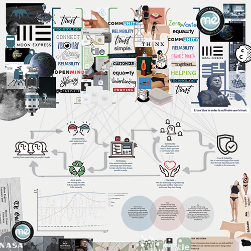
I chose 3 brands which is Moon Express, Tile and Thinx


The first brand is Moon Express which is a company with the goal of ultimately mining the moon 
for natural resources of economic value for the benefit of humanity. I already listed out in the plate
above on the right the terms that express the brands well which is scientific and futuristic of how they
 involved high technology and ambitious/visionary as how they made plan for the future already.  
Optimistic as how they are doing public education and campaign but importantly I choose to focus on
 trust and reliability becuase it's interesting how they haven't succeeded yet but many people still believed
they can. And in a diagram on the right I divided it in 2 ways of how they can gain trust.


The second brand is Tile which is a Bluetooth tracker device with a largest lost & found 
community. "similar to the first brand I list out all the main identity which is functional, smart,
durable and simple which can already describe Tile physically very well. Tile is also 
customizable where you can choose your own case or personalized your own Tile. The main 
topic I focus on is community. The video below will show how it works. The diagram on the right 
above shows the community from when there's not many Til user back in the past and Tile users
nowsadays. Tile not only connected people with their stuff but also connected people together.


The last brand is Thinx which did quite a good job of understanding what women want.
It is a period-proof underwear where it was once banned from the advertisement because 
they were using the word period so it's quite obvious that they are straightforward. 
It's also zero-waste because they reduce the use of tampons and they also do a charity
campaign for women in African. In the right plate, I focused on the technology and cloth 
they used, the sewing method and what happened in between layers.


On the last diagram, I choose the common identity between the two brands first to see the
bigger picture and narrow it down by combining all three and arrange it so it is more understandable.
As it shown its ends with trust so on the bottom I showed how trust had been made and gained
by the three companies and because everybody doesn't define trust the same way they did I had quite
a big problem on choosing what really is the issue to focus on.


______________________________________________________________________________________________
"Thank you"


SaveSave