-

-

Sunday, August 5, 2018

ARCH DESIGN II : PHASE III BY SUPANAT CHAIYANOPAKUL

ARCH DESIGN II : PHASE III


RICK OWENS PLAYGROUND
by Poom Supanat Chaiyanopakul

ABSTRACT


Clothes are about giving freedom to people-freedom to reveal,to manipulate,to express themselves. People nowadays lives the hectic and busy lifestyle. They need some activities to let them relax after all the stressfulness they received. However in this recent years, healthy and sportive lifestyle became more popular and approachable among our life. The results was many fashion brand came up with many interesting strategies to employ their own product integrated with sport features.


MOODBOARD


Rick Owens
FASHION DESIGNER

Originally from Southern California, fashion designer Rick Owens started his label in the early nineties after dropping out of art school. His first own label catwalk show was held at New York Fashion Week in 2001 and was sponsored by Vogue. Owens gained the CFDA New talent award in 2002.

Owens become artistic director of French furriers Revillon in Paris in 2003. He cemented his reputation as a designer in Paris and introduced a furniture collection, incorporating materials such as raw plywood, antlers, cashmere and marble into his designs. Drawing on his experience at Revillon, Owens introduced a collection exclusively dedicated to fur, Palais Royal. It was named after his Paris boutique. In addition, Owens has RickOwensLilies, a line devoted to his signature silk viscose jerseys and denim line DRKSHDW.
Owens has received numerous awards over the past few years. He most notably won the Cooper-Hewitt National Design Award for Fashion Design and the Rule Breakers Award from Fashion Group International in 2007. The same year also saw the release of his photo book, L'ai - Je Bien Descend?.


Monday, May 7, 2018

Prawn Keereewan(Jam) PROJECT1, PHRASE3

           Praewa Keereewan
               Jam
                5934779125

AJ.Payap Pakdeelao

Phrase3

                         In this phrase, We have to create or rebrand by crossing of selected brand. Firstly I use Glossier as a main brand identity and function by Casetify. Therefore, Glossier is a cosmetic brand which use for represent the neutral look for costumers to represent their identity. What about the brand can go widespread in to the term of show identity of a large bigger group of people. Fragrance is the product that I choose to rebrand Glossier for this widespread idea.

                         The system that I have think about is "Customization". First, I will encage people to come in to my site, they will interact with the exhibition zone which contain perfume in difference area,this zone can be called as an introduction. Next, the client can rather go up to the ramp which connect with two rooms, Ingredient room and laboratory room. Ingredient room will contain the various local ingredient and example and laboratory room is customized space where client can create perfume. To be addition, all of ingredient will transform by characteristic of that local site. For example SIAM, identity that I've choose will be Kallaprapruk flower, Banana leaf and Rice as examples. After the end of process all of perfume will be collect by static and the most mix and match perfume will be identity of this location. This system will give benefit into both of Brand intern of marketing and advertising and Local site to promote itself.


Site analysis


                                                I have transform the material as free form use with glossy texture as identity. The building will raised in the middle up to not be block pedestrian in both way of Siam square one side and Novotel hotel side. The tube on the top is for wind ventilation. and the building will surrounded with artificial yard to encage people


Interior perspective rendering


model


PROJECT 1 : MATERIALS MEME

PHASE 2


The exploration of materials from selected brands were based
on a basic construction material; concrete.
Because there is a vague image as to what physical material can be
derived from the three brands, most of which products are either symbolic
or digital. I therefore chose to work on a symbolical material of construction.
-
The language of this experiment is to use the general concepts from each
other company as a subject to which manipulates the selected material, represented
by red dot, it shows the idea of integration and combining elements to add
additional properties to the original, resulting in something more specialized.
-


The resulting materials with their additional special properties
may have a potential to be used in future cases where a specific material
property is preferred in different situations. a vast array of variations to concrete
may be created to accumulate different and more types preferences to which
is used for different purposes and serves a unique function.


Bear Sahasrungsri Wajchathon Project 1.3 Proliferate


PROJECT 1 : PROLIFERATE
PHASE 3
-

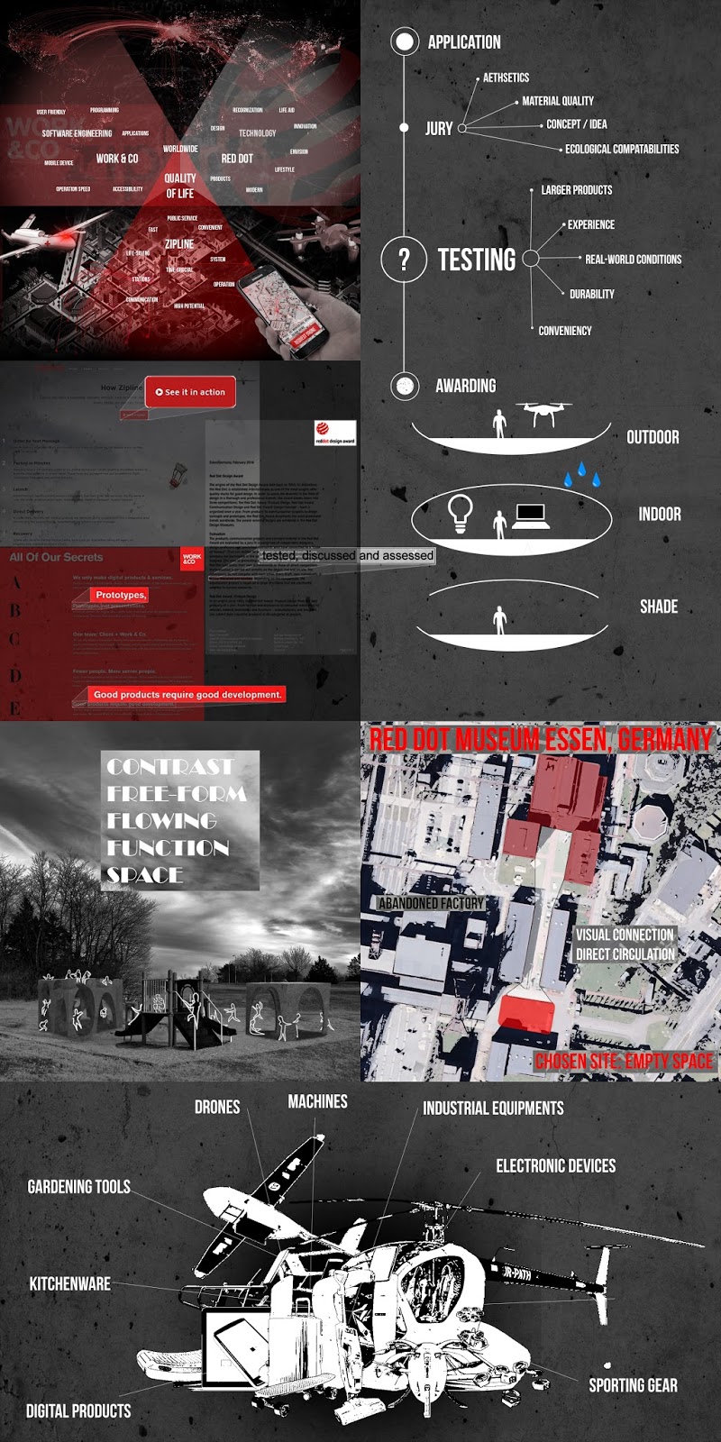
The "RED LAB" is a facility that provides space and equipment for
 'Red Dot' to enlarge theirjurisdiction capabilities, in order to further evaluate
 the competitors products. It contains spaces of different type
specific for different product testings, seperated mainly into
outdoor, indoor, and sheltered space.
-

The idea of this testing facility is to open Red dot's originally small and
private operation into a semi-public one, allowing other people,
for instance other competitors, to come and experience the products
themselves, rendering the area active and busy.
-

The shape and form of this building is aimed to emphasize the
properties of the materials explored from phase 2 an also to 
symbolize the genes of Red dot itself through its color scheme and logo.
-


PROLIFERATE : PHASE3 PROJECT1.3 : P JIRAYU ARIYADILAK


P Jirayu Ariyadilak
Payap Pakdeelao
Phase 3 Project1.3
PROLIFERATE
.........................................................................................

Continue from phase 2..

I bring the strength parts of Shimano which are bicycle and services due to the fact that
 Shimano hold 50% of global bicycle business because its performance and innovation.

Brand


From the research..
Shimano have sponsored services 17 of 22 pro teams in Tour de france 
and every teams that use the Shimano components won every stages. 
Therefore, I choose the Tour de France to be the program because
 it is the biggest bicycle race that have 21 stages, the last stage finish at Champs Elysees street every year 
so I choose Tuileries garden garden to be my site due to it located in the central of paris 
near the Champs Elysees street which is the finish line of the last stage of the Tour de France.

Context


 link to full resolution 300 dpi


Programs

 - Bike track for the cyclist around the building which go in and out of the building.
- The vertical circulation at the middle of the building.
- The bicycle and mechanical services on the 1st floor.
- The lounge for athlete only on the 2nd floor.
- The deck facing the champelyses street for the audience to watch the last races on the 3rd floor.

- The 360 theatre which is the exhibition that show the history and the innovation of Shimano.

Floor Plans


Elevations


Sections & Details


Focusing on, the construction technique I use the beam framing 
and scaffolding to represent the identity of Shimano which is steel.

Perspective views


The first atmospheric representation of the relationship of site and my building.


The second view is the view on the first floor which is the bicycle service.


The third view is the view of audience seeing the race.


Serve & Impact


- Increase rider performance.
- Encourage people in every age group to exercise.
- Allow people to get into the Tour de France more.
- Promoting the innovation and the performance of product services 

Section model


Complete model


So these are all of how Shimano lead my project to this point.


.........................................................................................


Phase3 : Proliferate ; Saimai Thanjira Vimonanupong

PHASE 3
PROLIFERATE

In this last phase of the project, we are assigned to reimagined the brands by taking the identity of the selected brands to create a new space or building. First of all, I started off with the research on what the 3 brands have in common. What i found is that what they all have in common are the sense of luxury, the level of customization, exceptional service, and lastly, the environmental awareness. Also there are similarity between brands such as the use of vernacular materials and the way brands keep contact with customers via music festival or a process email etc.


link to full resolution

What I then chose to do with the brand is to to redefined the luxury bag brand of 1 atelier into another chain brand called Atelier Envase which creates a customize bag with dynamic new design and will also have a shopfront to let customer have a closerexperience to the product

Also the Environmental concern- use the leftovers leather (make full use of the pieces of the leather) Uniqueness In the design of the bag and material, Exceptional service, Lower price cause by the location of the shop =right at the marina and the use of material
The shopfront for taking in the leather and the palce to display material. The product can then be sent to the customer when they are back at their home destination conveniently, or to the next shop at the next marina if they are travelling by a yatch, it does not only convenient for the buyer but the bag is also the keeper of memories of the trip or of the place they went to as well. The Vernacularity and the style of the region were also added as the shop will be situated in a different country and using local material in order to creates the bag so that the bag will contain the identity of each destination the shop situated.

The Context plate here shows the chosen site. The site is the island of Pulau Brani which is a small island in between Singapore main land and the Sentosa island. The island is relatively small with an area of 1.2 sqkm. and are now the container site and a marina. and are now  Singapore itself is in the Malakkan straits - which is a trading area since old times. To put a shop there would benefits in the ability to access the material in lower price and also took advantage in the location because it is situated near the marina and the famous holiday island of Sentosa which is flurished  with tourists.

The program of the building then being talked through the diagram above. This diagram shows what the program of the building is according to the floe of people. The blue people are the staffs and the red people are the customers. We can see from the disgram that on the first floor, the crowd of customer and staffs are completely separated as we have two areas dedicated for each. On the second floor we will see that there's only the customer there because on the second floor is the material library where customer will get to engage with the material and then slipped into the transition to the third floor. This floor is where the flow of the staff and the flow of the customer will collide. The artisans will be working on this floor which peopla can also walk along and watch as their bags are being made. Once the payment is done, the customer can choose to chill out on the balcony overlooking the marina and the Sentosa island before taking the outdoor stair out.


Here is the site plan showing the area and the attractions of the area.


A site model showing geographical elements of the island. How the water channel are located. and the terraiun atmostphere.

here are the floor plans of the building. the first floor plan shows the 2 area so f the staff and the customer. The staffs area are at the outer left corner of the building where they can sort raw materials into categories before display them in the first floor exhibition space. The space in the first floor can also be movable according to the partition in order to create different types of space for different occasion. The first floor then are filled with the display material which is the biobased paper as a structure creating a terrrainiun of structural form to display the bag. This also talk about the varnacularity and the ideas of being environmental friendly. 
link to full resolution

link to full resolution
Walking up the ramp, the second floor is the floor which has a very low ceiling in order to stay close to human scale.This floor is an open air material library which customers are free to walk around and experience the material of the region. In order for the customer to get to the 3rd floor, the customer have to embedded themselves through the leather wall, flipping and opening util found the void large enough to get through the wall in order to walk up the stairs to the third floor which is an artisan space where customer will order their bags with selected materials and then walk aroung to see the process of the bag being made and even get to talk to the artisans themselfs for if they have any question. The customer then can lounge and relax in the balcony overlooking the marina and the Sentosa island as to celebrate the new bag and to cherish the view.


link to full resolution

 link to full resolution
 link to full resolution

link to full resolution

link to full resolution

link to full resolution

Elevation of the building.


link to full resolution

 link to full resolution
link to full resolution