-

-

Monday, May 7, 2018

PHASE 3: PROFILERATE CONTEMPORARY BUSINESS FUTURE

PHASE 1.3

Tanatsorn Sriarj.

Pratana Klieopatinon

In this last phase we were to develop our chosen brand from the previous phase using the materials and methods from the brand. The three brands I choose are Citymapper, Shutterstock, and Social tables. 
In this phase I mainly focus on Social Tables by re branding it into "Social Tables Bangkok", despite being a normal typical eating event held in hotels like the other Social Tables event. The brand aims to serve as an alternative idea of Social Tables which is held in the urban streets of Yaowarat. 

The Brand page talks about the process of how to create the events: in the creators experience and how to join the eventsL in the users experience.

BRAND PAGE


CONTEXT 

Before i go into the architecture form and material. I will first talk about why I choose Yaowarat, I use the idea of my two other supporting brands I got from the previous phase (Citymapper and Shutterstock) into picking this site,because those two are online service application where you choose what you want each step more specific base on how much information you put in for Citymapper - travelling routes,  and Shitterstock - narrowing down images. I type in Urban bangkok streets in shutterstocks search engine and it narrows me down to the site of Yaowarat and then it explores me to different chinese decorations which leads me to found the object of a chinese lantern and its method of making : weaving method.

Program: Develop the idea of weaving from the Chinese lantern and construct it into a pavilion use for eating events which is held in different alleys of Yaowarat.

The context page talks about what the yaowarat city consist of such as alleys, food and different spaces all were shown in the picture.


SITEPLAN

In the siteplan page what I analyse are the space I thinks is vacant for helding my Social Tables bangkok event (pinpoint in read) and the buildings that are a restaurant or sells food ( colored in red) are use for the feast in our events.


ALLEY ANALYSIS

This page shows the different alleys I explore and analyse throughout yaowarat. What I analyse in each are the dimensions of the space in each alleys, the programs what it is used for and its vacant time.  The two space I choose to place my weaving structure on is the "Old market", and the "Tao Alley".

OLD MARKET

The reason I choose this space is because it is only used as a fresh market in the morning and during and throughout the day it is a free vacant space. For the weaving structure I built beneath the roof of the Old market I build it as an identity for our brand which is founded in Yaowarat. The design is base on the different anchor points which is place in the ground/ can be moved depending on the weaving designs.


PERSPECTIVE VIEW


TAO ALLEY

This is the other space I choose to put my structure because it is an vacant backhouse alley that isnt use for anything and is vacant throughout the day. The different here is that it dosen't have coverings and due to the limitation of the space I put some anchor points on the wall for a different weaving design .


PERSPECTIVE VIEW


PHASE 3 - PALIDA EMWATTANA

PHASE 3 - PALIDA EMWATTANA

PROJECT 1.3 - BRAND GENERTICS
PALIDA EMWATTANA
AJ.PRATANA KILEOPATINON
.........................................................

For my project, I research two brands : Xerox and Pantone, the former being the focus of my work and my designs.
The idea was from the 100 copies on a Xerox-made machine with the grid pattern. Seeing how much generation loss would occur after making 100 copies. I discovered that significant generation loss would occur with each successive copy; however, I translated this form dimensions to 3 dimensions,  I was able to crate a cube by creating the joint.
Pantone, I colored the cube with three primary colors (red,yellow,and blue).  I using the three color to define the different directions of the grid and make changes in direction at each joint more noticeable.


I explored a special project from Xerox called Set the page free, where Xerox worked with various writers to define the idea of the modern working space. The first of these was a female author who defined her working space as a roof, a floor, a door, and stairs; for her, I designed a space that featured every item on her list, highlighting that it doesn't have to be a single room but could rather be a single structure. The second author mentioned that his work space must be invisible; thus, I designed a mirror-covered structure.The third author describe their work space as architecture in motion;for her, I developed a concept revolving around a motion-shaped structure with adjustable mirror.The forth author described  their ideal work space as a office is a bed; for him, I designed just a small room with only one bed for him to work. The final pair of authors wanted to sharing the idea when they work. 


Using both previously-mentioned ideas (the grid and the workspaces), I selected the Xerox office in Lisbon,Portugal, as the idea building for me to work with. This office is perfect for my project because it has an emptry space middle zone that surrounded by a grid-like structure of mirrors; this zone has nothing inside of it and can easily be used. Within this middle zone, I plan to construct with stand alone and be a self-contained workspace,but they will feature stairs that face the workspaces of the other authors and follow them to descend to the ground level and communication and share ideas.


This is the elevation of my design with a dimension.


Phase3: Proliferate (contemporary business future)

Booontita Boonsusakul

Pratana Klieopatinon


This phase is the brand integration of our brand analysis from phase1 and brand material from phase2. OfoRest is brand integration from 2 brands which is Ofo[ Bike sharing platform] and City mapper [Public transit application]. Ofo rest want to serve needs for bikers or ofo user to have  good experience of resting in an adjustable bikestation and make public transportation become more accessible.
The design was developed for the most important bike which is call smart lock. The ring smart lock provide gps which give data company, and the automaticly unlock Qr code when scanning .


Explotation of bike station stucture


This platform is introduce to Milan which have both brand available and with a high dense of traffic. The structure will connect to different public transportation that are existing in Milan .
The connection of structure to public transportation was begging by choosing A to B routes. The example routes was starting from Milan information center  passing Duomo dimilano [Milan center] to Darsena Dock[Dock of Milan].  This illustrate an example of the possibilties of how we can connect the structure to those existing one. 


Now the brand would be promote by ofo center which is desiing from the connection of each ring creating more larger struture. The is center is like the gathering space fore ofo users  which have an small working space a cafe, the ofo information, and. bike ramp . It will be and starting point for some ofo event or ofo day trip that promote ofo brand. It is place infront of milan museum and beside Duomo di milano which the site that is abundant. It also placing on the urban land scape slope to enhance the stucture and look attractive


On the top of landscape is a work area and ofo office. The highest floor level allow ofo staff to see the view of the whole area for well organize

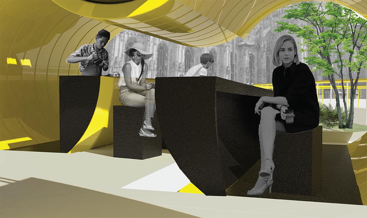
The perspective view of of cafe below the level of ofo office.

Interior view of  ofo cafe


Interior view of ofo office and co-working space


Plawan - Nithikorn Seangkeaw :Phase 3 ( PROLIFERATE CONTEMPORARY BUSINESS FUTURES )


Plawan - Nithikorn Seangkeaw
phase 3 :
Aj. Pratnara Klieopatinon

______________________________________________________________


From the previous phases, the three brands that I chose are SOM, one of the biggest architecture firms in the world along with  Pantone, A company which creates a standard colors for everyone by using reference number ( coding ) and Casio, the brand provides an innovative products such as a watch, printer and etc. 


From the material studies, the threes brands have each of its individual materials research. SOM, I did research on the building facade condition, for instance, the dept, the material and the layers of building's facade in form of plate pattern. Casio, I focusing on Mofrel ( 2.5d printer ) which I  experimented on how to create a surface on color clay by using those plate pattern from SOM to stamp on it. The last brand, Pantone, I experiment on how one single color can perform in many shaded by the different light and materials conditions. All these brand's research were developed to be part of Pantone and became "Pantone experience".

The objective of Pantone experience is to create participation from local people and tourists to the variation of one single color through structures ( the shape and the way to illustrate inspired from each particular site). Moreover, this structure is not just showing the variation of one single color but also helping visitors to be more convenient by adding more features to the area and promoting Pantone to the bigger market.


" Toorjira ka Jara stepwell", Jodhpur city, was chosen to be a site for introducing first Pantone experience event to the town, where most of the buildings in this city were painted with blue color and people also called this city as Blue city. Therefore, this was the reason why I chose blue color as my structure's color. Moreover, The surrounding of this site is the place where they do not have much of blue building but the color of sandstone brick ( yellow-brown). This will make a blue structure become more obvious on the site and emphasize the identity of the town as well.


The main material of the first Pantone experience would be colored concrete because the particular material of the building in Jodhpur city is sandstone brick so this material can well reveal the singularity of the town.


Due to the Jodhpur stepwell is now the unofficial local swimming pool and the meeting space of the local people and tourist so 
the first design for this site will works as a storage for visitors convenience and site development.


Elevation


Section


Atmosphereric 1


Atmospheric 2

Joint Panas Saengvanich project 1.3

Joint Panas Saengvanich
Project 1.3
Aj. Pratnara Klieopatinon

Wilderness Safari Pavilion

Wilderness Safari and SOM are the two brands considered as the major subjects for the architectural design. The local elements, local African botanical, and the idea of cultural community are taken from the safari brand, and the research study of natural structure is analyzed from SOM.

The chosen botanical is Coco de mer, a kind of palm which present the gigantic leaves and its seed break the world record as the biggest seed in the world. With the combination of the two brands, the leaf was studied, analyzed and abstract the form, material, performance and structure.


Seychelles International Airport, Seychelles, an island in Africa, is the site for the design because it is the home town of Coco de mer,  and having the infrastructure inspired by the leaf will be a kind of promotion the local nature. Furthermore, as it is the airport, people from both local community and foreign travelers are able to participate the space.

Africa art and craft present a very unique style that reflect their culture and community. Therefore, the program of the space is going to promote these valuable work in form of a gallery or an exhibition at the airport.

These are the study and the exploration of the form of Coco de mer leaf by study the surface, structure and form performance.

The final design conclude the overall structure and geometry of the leaf as the major structure of the design are the primary and secondary structure presented as the strongest structure which hold most of the load. Another element is the folded surface presented as the roof. The folded pattern depict the leaf surface and its performance of covering. Other minor structure are the presentation of the section and the geometries appear on Coco de mer.

With the shape and program, as a result, Wilderness Safari Pavilion is the entrance gate of the airport where the ground floor is the road for cars and the second floor is the outdoor space for  temporary exhibition of the local art.


Sunday, May 6, 2018

Phase 3 Buncharin Eua-arporn

PHASE 3

Buncharin Eua-arporn (Noopin)

Aj.Pratana Klieopatinon


The circulations mapping inside the Carnival Cruise illustrates both with and without a medallion experiences. The ones with Medallion are creating shortcut experiences.


From the previous phases, the two brands Carnival Corporation, the cruise service along with Citymapper, the application which provides the fastest routes for travel at real time, were developed as an extension of the Carnival Corporation brand and became 'Carnival in the City'.

Carnival in the city's main idea is focusing on create a shortcut experiencing in the city for both cruiser and locals which will not only accommodate the cruiser but also a great opportunity to promote the brand to the bigger market.

A market is considered to be a place with diversity. It is where different types of people gathering, observing new things and exchange ideas.

One side of  Binnenalster lake in Hamburg was chosen to be a site for a new Hamburg city's market where local food products from different parts of Hamburg are brought together in a same place.

From the material studies, the two brands have the same material in organizing flows and from the circulation mapping in both the cruise, the sponge experimentation and the Citymapper application it is clearly shown that circulations are normally curving, adaptable and asymmetrical therefore, the structures are inspired to be the curving structures and were categorized into four types according to function and space of each and to support the flows of people within the area.


All the four types came from a simple single box which had been designed with the positive and negative space between top and bottom corners creating different curves with different function within each structure.  For walking area where is supposed to be the market area is under shadow and the stop-by area are having openings to let the light and wind flows into the spaces.

    Type A 's structure is mainly support the market function where it needs lots of walking space.At the same time, type A has a center stop-by area for people to chitchatting and enjoying their bought products from the market.
    Type B has a diagonal walking area and stop-by area at the two corners. 
    Type C is similar to type B but has more walking area with one corner stop-by area.
    Type D is the most opened type to support the stop-by area.

The arrangement of the structures are according to the site. The structures are all placed on the added platforms which transform the steps space into a flat space. The area are divided into 3 main areas; from the left where is the closest area to both underground and pier is designed to mostly market area to welcome lots of people come through, the center area is the mixed area between market and stop-by area and the right area is mostly stop-by area for people to relax and enjoy the atmosphere. Each area is divided by the steps way which leads to the lake. 


The flows within the area is showing the ways people move and is resemble the sponge's solid and void spaces from the previous phase.

This site plate shows the dimension of the site and the circulation around the site area.


The plan, sections and elevations are clearly show the solid and void areas.


As this market place is initially designed for cruiser to have a shortcut experience of the stop-by city within the limited time. Therefore to support the connection of people(the cruiser and the locals) and  the lake atmosphere as much as possible some of the structures are translucent.

The axonometric drawing illustrates the connection from the street into the structures and to the lake.